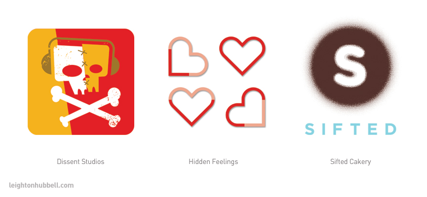
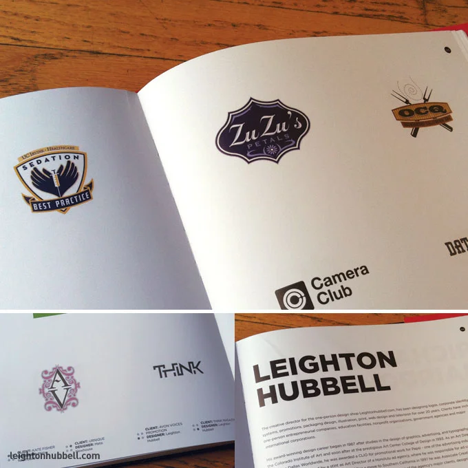
Again, I am honored to be included in the latest volume of Rockport Publishing's LogoLounge 11 by Bill Gardner and Anne Hellman. To date, I've had nearly 100 logo designs featured in 13 of the LogoLounge series books.
Read MoreLogo design work honored in LogoLounge 10.
I am truly honored to be included again in the latest volume of Rockport Publishing's LogoLounge 10 by Bill Gardner and Anne Hellman. To date, I've had nearly 100 logo designs featured in 12 of the LogoLounge series books. It's a tremendous collection from some very inspiring designers across the globe.
A little about this edition
LogoLounge vol. 10 presents the 2,000 best logo designs as judged by a select group of identity designers and branding experts. Logos are organized into 20 visual categories for easy reference. Within each section, case studies allow a closer look at designs from diverse firms such as Hornall Anderson, Lippincott, Tether, Von Glitschka Studios, OCD and more. Each story details the logo design journey, from concept to finish. LogoLounge vol. 10 is the definitive logo resource for graphic designers, brand managers and start-ups looking for ideas and inspiration.
The publishing release date is set for October 20, 2017.
Ethical Hacking | Denial of Service for LinkedIn Learning
Work featured in Von Glitschka's Lynda.com course, Iconography.
Today, fellow designer and illustrator, @Vonster (Von Glitschka) released his latest Lynda.com/LinkedIn Learning course on Iconography. I was honored to have some of my work included in the Designer section of the course showcasing some of my icon work, along with some other very talented folks such as Paul Howalt, Brian Brasher, Felix Sockwell, and Gedeon Maheux. Give it a look. Some great information there.
New interview with Illustrative Designer, Leighton Hubbell on VoyageLA →
These things always amaze me. One of the editors from Voyage LA came upon my website and portfolio and approached me about an interview. I am always happy to oblige. You never know who you might inspire or eventually help with design services. Check it out.
Logo design work honored in LogoLounge 9
So honored to be included again in the latest volume of Rockport Publishing's LogoLounge 9 by Bill Gardner and Anne Hellman. This will be my 90th logo featured in 11 LogoLounge series books. A little bit about this edition:
LogoLounge vol. 9 presents the 2,000 best logo designs as judged by a select group of identity designers and branding experts. Logos are organized into 20 visual categories for easy reference. Within each section, case studies allow a closer look at designs from diverse firms such as Hornall Anderson, Lippincott, Tether, Von Glitschka Studios, OCD and more. Each story details the logo design journey, from concept to finish. LogoLounge vol. 9 is the definitive logo resource for graphic designers, brand managers and start-ups looking for ideas and inspiration.
If you'd like to get your own copy, here's a link.
Astute Graphics April 2015 Featured Artist: Leighton Hubbell
A few months before I started putting together my March of Robots vector illustrations, I had purchased the full suite of Astute Graphics plugins for Adobe Illustrator. Let me just that they are amazing! Lots of time-saving tools and features that definitely make a difference in my workflow. So significant, I had to spread the word to many of my colleagues.
Well, go figure. Back in April, Astute Graphics has a Twitter contest of users tweeting their creations using the AG plugins. Lo and behold, yours truly gets a shout out and with that, they wanted to interview me. In addition to some usual chatter, I share some behind-the-scenes info about how I used them.
Featured designer: Leighton Hubbell on the LogoLounge blog.
I am pleased to announce I've been chosen as Featured Designer on the LogoLounge blog this month. It's quite an honor considering how many wonderful and talented designers are contributing to the LogoLounge series of design books all the time. You can catch my interview with Dorothy Ayon on the blog.
Featured work in Rockport's Design: Logo.
I am especially excited about this announcement. In late 2012, I was contacted by Paul Howalt and Von Glitschka about submitting some of my logo work for a new book they were putting together for Rockport Publishers entitled, Design: Logo. First of all, I was flattered to be included in the group, and have the utmost respect for both of their work. Between the two of them, it was going to be a cool book, for sure. Well, after chatting more with Paul, they decided to not only include a number of my pieces in the volume, but also feature a project I did for Avocadoville in one of their Closer Look spreads. I was more than happy to get some images shot of the work to be included in the feature. Thanks to Will Hare for the photography.
As it turns out, there were around 1,700 logos selected for the book, and work being included from some of the best logo folks in the business: Tim Frame, Chris Parks, Carlos Fernandez, The Greteman Group, Hatch, Jeremy Slagle, Joe Bosack, Jon Flaming, Joseph Blalock, Rule 29, Luke Bott, Mint, Randy Heil, Rian Hughes, Felix Sockwell, Thinking Cap Design, Gyula Nemeth, Ty Mattson, Ty Wilkins & Brent Couchman.
Not to mention, some great essays from five of the top branding industry thinkers: Bill Gardner, Alina Wheeler, Sherwin Schwartzrock, Justin Ahrens & Tracy Sabin.
Well, to see it in all of its glory was pretty exciting. Not only is it well designed, the content does not disappoint. Having a pretty extensive logo design library of my own, I have seen my share of design books. The essays are pertinent to the industry and nicely written, the logo work exemplary with little to no filler, and the art direction is well done, without taking over the work. It's definitely a nice addition to my collection, and certainly a nice cross-section of what's going on in the identity arena. You should certainly pick up one for yourself, now available on Amazon.
Logo design work appearing in LogoNest 03 - Black and white edition
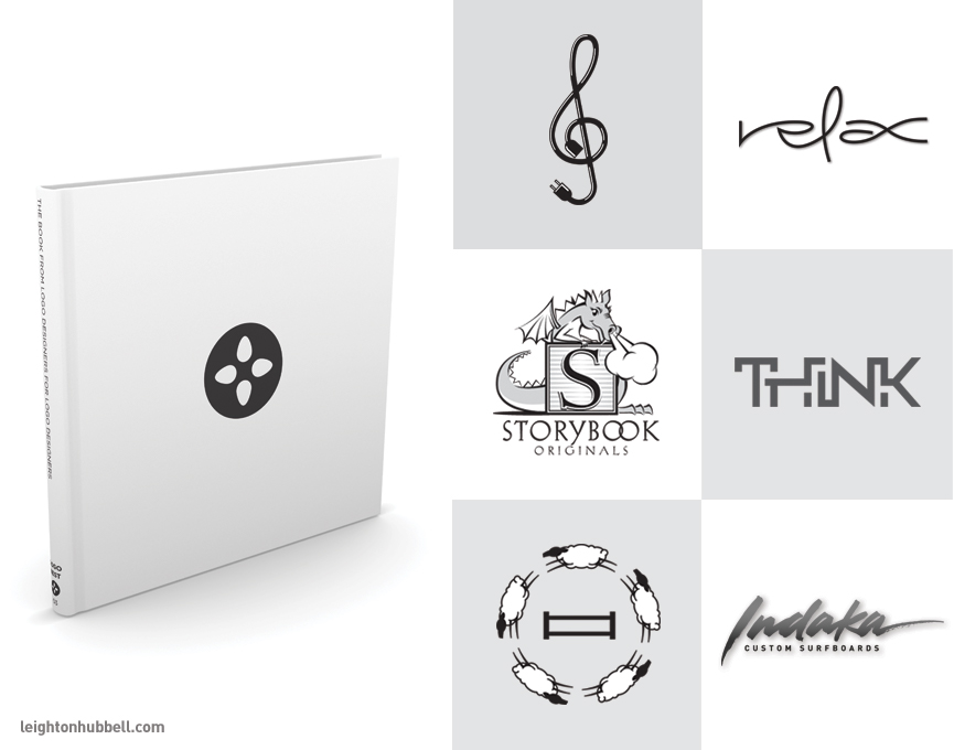
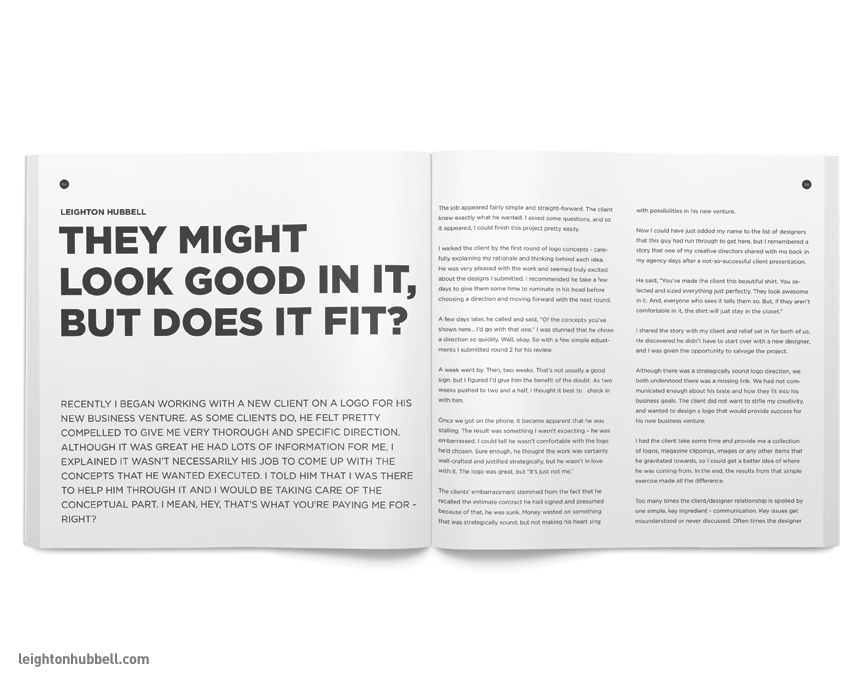
Today I am excited to announce my logo design work appearing in the new LogoNest 03 - Black and White edition. This series of inspirational logo design collections continues to get better with each edition, and this one explores the essence of a truly strong mark - appearing in, you guessed it, black & white. As with the first two volumes, the books from logo designers for logo designers asked me again to be a writing contributor. I guess they figure I've got something interesting to add to the cool stuff that's already in there. So, who am I to protest? In the previous books, I've written about the Power of a Good Logo, and Longevity in the Logo Business. This time, I chose to write about selling in good work entitled, They might look good in it, but does it fit? With each edition, my writing chops get better and better (I hope). Should you pick up a copy, take it all in and of course, I hope you like the article.
Well, here's some of the work that will be appearing in the new volume. Keep your eyes out for the new book at LogoNest.com.
The opening spread to my contributing article entitled, They might look good in it, but does it fit?
Featured showcase on Logopond
Since I first posted work on Logopond.com way back in January of 2008, I've seen the site grow from a hardcore bunch of logo geeks (my people!), into a thriving design community. It's been great to see the many designers from all over the world posting up work to show their wares, discuss the nuances of ligatures and line weights and get in a healthy debate about the many critiques happening every day on the site. I've made many an online friend from my days posting logo work - and even met a few in person. Now, I'm honored to be among the few that have my work showcased on Logopond. You can check out my collection and even peruse the site yourself. There's always plenty to see.
Logo design work to appear in LogoLounge 8.
I've been participating in the LogoLounge series by Bill Gardner and Catherine Fishel since submitting work to LogoLounge 2 way back in 2003. It's hard to believe it's been that long. And even though it's been ten years for me (and now the tenth volume that my work appears), it's still exciting when you get word that you've got work in the next book. I am honored to share the latest work here that will be appearing in the upcoming LogoLounge 8, scheduled to publish later this year. LogoLounge from Rockport Publishers is one of the premier design book series that celebrate and showcase the best in logo design throughout the world. There are only 2,000 logos selected for each book out of the now over 200,000 in their database. Some of the best logo work from the top designers and design firms in the business.
You can see my profile on the LogoLounge site under Hubbell Design Works.
The Logopond design book has arrived!
After a lot of discussion, blood, sweat and tears, the inaugural volume of the Logopond logo design book has finally been published. Much credit to David Blanchet, the founder and curator of the website, Logopond.com for making this all happen. All in all, from my initial thumbing through, it certainly is a nice first-time effort. I am honored to be included (and on the very first page, mind you! Sweet.) with all of the other 'Ponders. Some really nice work is in there.
As an added bonus, I was asked to include a profile page along with my logo wares, with some interesting questions about how I became a logo designer and other bits of info. If you decide to get yourself a copy, you can certainly take a look. As with most of these self-published efforts, there aren't a lot of copies available, so make sure you order yours now.
I certainly hope this first effort will be something we start to see on a regular basis. Cheers, guys!
300 Random icons project completed for 2012.
Well, we’re firmly planted in 2013, and the 300 Random icons design challenge has been completed inside my self-imposed deadline. Woohoo! So, what’s next you say? Are you going to do some other 300 Random challenges, maybe a poster or a book? What? What? Did Oprah call? Well, no. No Oprah.
The truth is, I’m not sure yet. To be honest, I’m still reeling from the fact that I don’t have to stay up late every night cranking out new icons for the blog – which is nice. And, my brain’s enjoying the recovery at the moment.
After chatting with some of my friends over the holiday about next steps with the blog, I’ve decided to do a little post-game analysis of the work. You know, really look at the stuff and see what shakes out. Just from a cursory glance I can think of a handful of blog posts that might cover anything from reader favorites to stylization to background shapes. Could be interesting?
So, check it out and put in your two cents. I’d like to hear it.
Logo work honored in iheartlogos Season Three.
Once again, I am honored today to find out I will have my logo design work in the upcoming volume of iheartlogos Season Three. The iheartlogos.comcompetition model is unique in the fact that the work is judged not by a group of select designers sequestered in a room, but by your own competitors. You are the judge. And so is everyone else. Every season, the work submitted gets better and better, so I am honored to be included in Season Three’s offering. I can proudly say I've had work in all three volumes to date, with this season being my strongest showing. After a strong showing in the first two books, this series continues to grow with greater and greater potential. As usual, I’m looking forward to seeing it in person in all its glory.
Congratulations to the other designers and firms on their selected work. Cheers.
Designing the Bancroft Bulldogs logo
Just completed: a new sports mascot logo design and illustration done for the Bancroft Bulldogs, a private school located in Boston, Massachusetts. Bancroft School's ad agency, the Kor Group reached out to me about working with them on this fun and challenging project for the school's middle and high school students' sports program. They had seen some of my other sports work and wanted to create something bold, unique and tough to go with their chosen mascot, the bulldog. Well, the 'tough' thing about designing a bulldog mascot is, well it's been done – a lot. In fact, my biggest fear working on this project was treading on previously covered ground and having to start completely over. So, I thought the best tact to follow was to start sketching and see what comes up. After drafting up a few directions I would check my usual sources to see if we had something different enough to stand on its own, and go from there. Here are some initial thoughts on poses and profiles.
After those loose sketches, I worked up some stylizations of the poses and tried some variations on graphic approaches to the bulldog.
So, I sent these sketches over to the agency and got their feedback on the directions. Upon some review, I got some suggestions on which designs to focus on. I must say, I did quite a few sketches with dozens of refinements and variations to finally arrive at concepts I was happy with.
Finally, when the concept (that would eventually be the final design) came along, I think we all agreed that that was the one. What a relief! The next step was figuring out how the bulldog's head would be integrated into a completed logo.
And then finally, the rather clean version of bulldog and angled, bold type would prevail as the final selection. As a regular practice, I try to apply the completed logo on to assorted clothing and athletic equipment so everyone can see how it will look in real world applications.
I hope you like the work. Special thanks to Bancroft School and Kor Group for the project.
As an added bonus, I created a time lapse video of how the logo was rendered in Adobe Illustrator. It's roughly 4 hours of vector rendering time compressed into 3 minutes – all done from the approved pencil sketch. Enjoy.
Tree of life - 50th Wedding anniversary illustration
This project was something that doesn't come around very often. If you're lucky, it's once in a lifetime. My wife's parents recently celebrated their 50th wedding anniversary – a truly amazing feat anyway you look at it. Two people have been able to share a wonderful life together, through thick and thin for half a century. That's pretty awesome. So, what in the world do you give them as a gift? Well, if you're like me, there's always someone in the family that will quickly throw your name in the hat to help out. That someone was my wife. Go figure.
To be honest, I have a great relationship with my in-laws and have shared a long history with their family. A lot of the adventures and experiences that the family has shared have been told to or experienced first-hand by me. When the concept of a tree-of-life was mentioned, I gave it a lot of thought. What better way to convey the many adventures they've shared together over 50 years, several states, three kids and a smattering of grandchildren? It made perfect sense and I was honored.
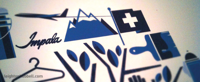
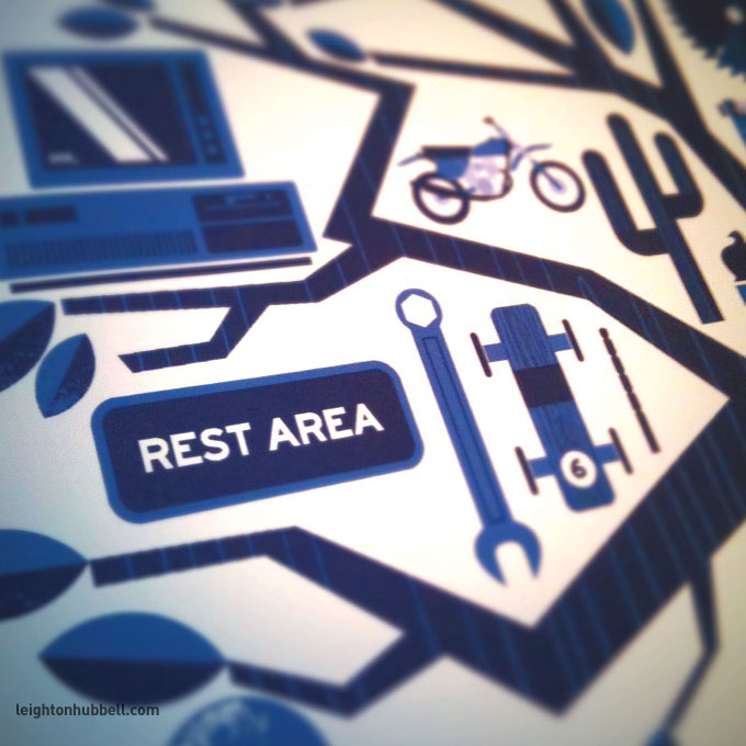
Now, I know this isn't the first tree-of-life illustration to grace the planet, but it would be my own personal rendition of the idea. I would take the many details and experiences from the family and try to depict them in icons, collected together into one, robust and sturdy tree. Since it would probably get pretty busy with all the different colors of everything, I tried to limit it to just two shades of blue. And, to make the tree even more special, I would draw the lower boughs into the shape of the number '50'. See if you can make that out in the last photo.
Some thumbnail sketches from the sketchbook.
And, some details from the finished illustration.
Needless to say, they were very touched with the result. Big smiles on their faces, and even some tears – that's always nice to see. The best part is watching them pore through the different icons and interpreting the significance of each symbol and discovering details they hadn't noticed before.
It was certainly a great way of giving back to people who've made your life that much more complete – in their own way.
Logo Nest 02 has arrived!
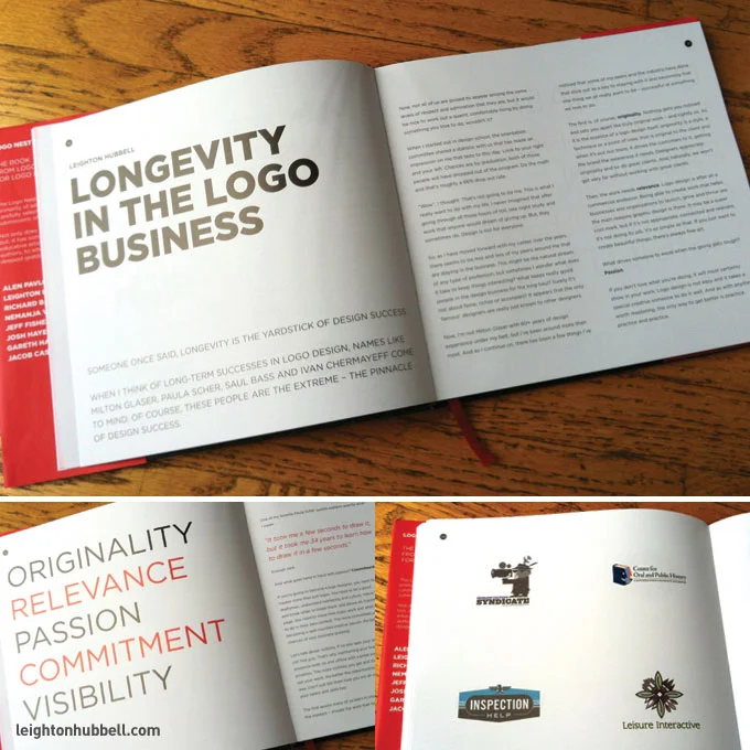
It's pretty exciting. I've been getting a few new design books recently to add to my collection. So, I've been hanging out by the mailbox eagerly awaiting my next package and there it was, the latest Logo Nest volume – 02, the book from logo designers for logo designers. This one is particularly compelling as it is the second Logo Nest book that I have been a contributing writer, as well as a logo designer. For LN02, I was asked to write pretty much anything logo-related that I thought was relevant to our times, and might be particularly useful to the logo design community. After much thought and deliberation, I chose to write my article on Longevity in the Logo Business. After a fair amount of time under my belt myself, I thought it was something I can really talk about. You can read an excerpt of my piece here.
I must say I am always a bit nervous sending in some of my writing for a book. As a designer, I'm not as comfortable with writing as I am with my design work – so be kind. I hope it reads well. There are some other great logo designers and contributors that were selected to write as well, such as Alen Pavlovic, Richard Baird, Nemanja Veselinovic, Jeff Fisher, Josh Hayes, Gareth Hardy and Jacob Cass. Be sure and check out their articles, too. There's lots of great information for some very diverse subjects within the logo design industry.
In addition to the writing, I had 12 logo designs selected to appear within the pages. It is especially flattering considering the limited amount of space, the print run and the level of work. See my previous post.
I think this latest edition went pretty well overall. There are some noticeable improvements over the inaugural volume and I'm certain the momentum will continue to the next one. Make sure you order yours soon, before they're all gone.
iheartlogos Season Two has arrived at the studio
Well now, it is here. After much anticipation, I finally got around to ordering my copy of the new iheartlogos Season Two to add to my ever-growing library of logo and design books. I received word last July that I had work selected to appear in this volume, but as competitions and books go, we can't always have our instant gratification. Sometimes we have to be patient and wait! If you're not familiar with iheartlogos, it is a logo design site and competition that has a slightly different approach – all the entries are collected, then voted on by the other participating competitors in the season. In essence, the group picks the best work to appear in the book. If you make it in, then your peers thought it was nice work as well. It's as simple as that.
So, in short, this season's volume did not disappoint. I thought the variety of work was strong and balanced, with less work appearing that seems to over-saturate the many logo design blogs out there. Apparently, I'm not the only one who feels that way, which is a testament to the iheartlogos voting structure.
The paper quality was pretty good, but hopefully next season's volume will be able to budget a stock with less show-through of the surrounding pages. Overall, pretty good for a short-run printing of only 1,000 copies. If iheartlogos continues to grow and gain some traction, I'm sure the quality will improve exponentially in the coming seasons. Also, another nicety would be a directory in the back with corresponding page numbers for each designer's logo entries.
Overall, I'm proud of the work that got selected and am glad to participate in the competition. I look forward to Season Three. Don't forget to enter your work.
Logo design work and writing contributions for Logo Nest 02
I am very proud to announce that both my logo design work and writing contributions will be appearing in the upcoming Logo Nest 02. There will be 12 of my latest logo designs included in this, now second volume of the book known as the 'design book for logo designers, by logo designers'. As the inaugural book, Logo Nest 01 was being conceptualized, I was flattered to be asked to contribute my writing and experience to the effort. Well, I guess they liked the article enough to ask me to write some more. Who knew?
Here is an excerpt from my new article for Logo Nest 02, entitled Longevity in the Logo Business,
When I think of long-term successes in logo design, names like Milton Glaser, Paula Scher, Saul Bass and Ivan Chermayeff come to mind. Of course, these people are the extreme – the pinnacle of design success.
Now, not all of us are poised to appear among the same levels of respect and admiration that they are, but it would be nice to work out a quaint, comfortable living doing something you love to do, wouldn’t it?
When I started out in design school, the orientation committee shared a statistic with us that has stuck with me to this day: Look to your right and your left. Chances are by graduation, both of those people will have dropped out of the program. Do the math and that’s roughly a 66% drop out rate.
Wow, I thought. That’s not going to be me. This is what I really want to do with my life. I never imagined that after going through all those hours of toil, late night study and work that anyone would dream of giving up. But, they sometimes do. Design is not for everyone.
Here is the collection of my work that will be included. Be sure and reserve your copy now.
Logo work included in the new Logopond design book.
This is pretty cool. After much discussion and preparation, the logo design inspiration site and forum, Logopond.com is publishing a design book. I am fortunate enough, with many of the talented logo design geeks of the world to be included in this inaugural volume.
The site has been a great, constructive avenue for me to help critique and discuss all sorts of inspirational logo work over the last 3 or 4 years, and make some wonderful online friends, too. With the amount of traffic the site gets, it has been a creative springboard for many a fledgling designer as well.
So, knowing in a more intimate sense of the level of designers that participate on a regular basis, I am looking forward to seeing the other contributor's work in all its printed glory. I suggest you reserve yourself a copy.

